

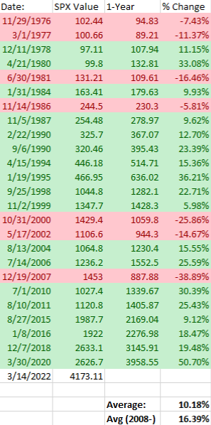
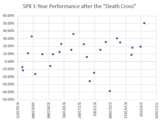
S&P500 Performance after forming "Death Cross"
S&P500 Performance after forming "Death Cross"
The S&P500 formed a "death cross" Monday afternoon.

The “death cross” is a chart pattern signaling price weaknesses, typically when the 50-day moving average crosses below the 200-day moving average. The death cross has preceded all the severe bear markets in the United States, including 1929, 1938, 1974, and 2008.⁽⁵⁾

Although the “death cross” has preceded all bear markets, it doesn’t necessarily point towards a bear market. In fact, since 2008, the 1-year time period following a death cross has returned 16.39% on average, and 10.18% on average since 1976. The indicator doesn’t signal towards a bullish market, but it certainly isn’t a bearish either.
¹Source: Macrotrends, as of 3/18/22, S&P 500 Index - 90 Year Historical Chart
²Source: Investing.com, as of 3/18/22, S&P 500 Historical Data
³Source: Nasdaq Dorsey Wright, as of 4/6/2020, Some Historical Perspective on the S&P 500 Index "Death Cross"
⁴Source: Finviz, as of 3/18/22, SPY
⁵Source: Investopedia, as of 3/16/22, Death Cross